


This brief post by Doug Short is even more important than it appears to be. We had an outburst of neoliberal orthodoxy in comments yesterday on a post that discussed how wealth of most households had fallen since 1987. Some readers assigned blame for stagnant average worker wages (which was a big contributor to the lack of growth in household wealth) to immigrants, particularly Mexicans and H1-B visa workers.
While immigration was no doubt an element, to give it the leading role is counterfactual. The argument made, explicitly, is “more workers leads to lower wages”. Ahem, there a a lot more variables than just the labor supply side. But even if you take a simple-minded point of view, women’s rising participation in the workforce, particularly given that women even now make 77% of what men make, would be a vastly bigger wage-rate depressor than Mexican workers. The number of working women rose by nearly 30 million between 1970 and 2010, vastly larger than any estimate of immigrant influx.
The Doug Short chart below looks at corporate profit share versus labor share. This pinpoints the degree to which wage stagnation is the result of corporate managers and executives succeeding in cutting the pie to favor themselves (executive pay has become increasingly linked to stock prices, and relentless focus on short-term earnings, as well as stock buybacks, do wonders for earnings per share).
Short omits some key elements from his discussion. One is that until recently, a profit share of GDP of 6% was perceived to be a cyclical peak; no less than Warren Buffet deemed a higher level to be unsustainable. And in fact, we see an explosion of profit share from 6% to 10% of GDP in the runup to the crisis, roughly from 2003 to 2007. The “rescue the banks and financial markets” measures succeeded in bringing the profit share back to its pre-crisis levels, at the expense of workers.
Notice the inflection point in profit share is 1987, when Greenspan became Fed chairman. Correlation may not be causation, but the timing is almost exact.
But what about the years prior to 1987? We see falling labor share and rising profit share from the 1973 recession through 1979, then labor share and profit share falling through 1987. What is that about?
Interestingly, the chart shows that corporations did well in profit terms in the mid-1970s stagflation at the expense of workers. But they were perceived (correctly) as having their lunches increasingly eaten by Japanese and German manufacturers. Inflation kept rising, which hurt investment in plant and equipment (high interest rates make any long-term commitment look lousy). High inflation killed stock market valuations, which allowed corporate leaders to press an agenda of deregulation with the Carter Administration, which was desperate for any ideas to increase flagging growth levels.
In 1979, Volcker started pushing interest rates sky high. Banks and other financial players were hemorrhaging losses. Volcker was explicit privately that he wanted to break the bargaining power of labor. In Secrets of the Temple, William Greider reported that Volcker kept a notecard which tracked average pay in the construction industry. He wanted to see that fall before he was willing to let interest rates ease. The economy went into a sharp, nasty contraction, hence the reason for both falling profits and falling labor share.
But why did corporate profits continue to fall after the 1979-1982 recession was over? I’d hazard a big contributor was the rapid rise of the US dollar, which not only killed US exports, but also enabled foreign manufacturers to gain even more ground. If you look at auto imports to the US, the Japanese made tremendous headway after the dollar spike of the early 1980s.
By Doug Short, Advisor Perspectives. Cross posted from Wolf Street
Yesterday’s collection of Advisor Perspectives articles particularly caught my attention: Why Jeremy Grantham is Right about Corporate Profit Margins by Baijnath Ramraika and Prashant Trivedi. The article includes a number of fascinating graphs, the first of which is a snapshot of US Corporate Margins since 1947 calculated by dividing Corporate Profits after Tax by Gross National Product.
The article inspired me to produce a chart of the Profit-to-GNP ratio, but with an added and rather sobering overlay: Employee Compensation (wages and salaries), which I’ve likewise divided by GNP. Here it is.
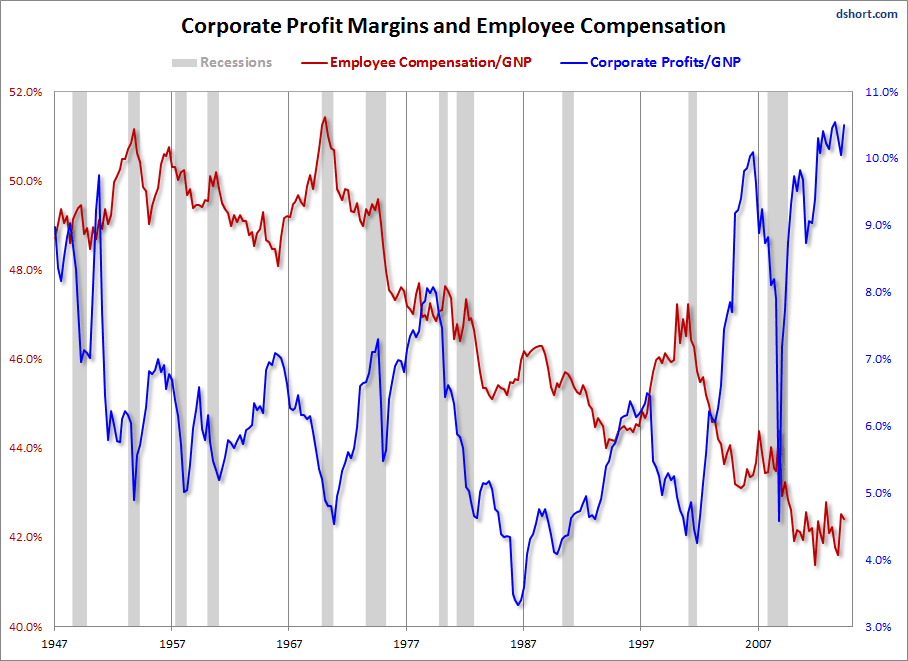
If indeed corporate profits are mean reverting, a view supported by the authors of the Advisor Perspectives article, we see that this metric can spend many years at wide variance from the trend. Employee Compensation, however, has had a distinctly downward trend since its peak in 1970. The only conspicuous exception to the trend was the bubble period of “Irrational Exuberance,” as then Fed Chairman Alan Greenspan famously called it, that began in the mid-1990s.
And when it comes to wages, there are “Lies, Damn Lies, and Statistics.” Read… How to Obscure one of the Biggest Economic Problems in the US
0 comments:
Post a Comment